Fixed headers are a common design pattern that keeps navigation essentials in easy reach as users meander down a page. Keeping a header fixed as the user scrolls can free up horizontal space for smaller devices by avoiding sidebars, and keeps your branding visible.
Anchors are another important navigation tool, linking not to a page but to a specific location in it. Whether for a long article, multiple parts of documentation, or navigation within a page broken up into sections, anchors can help users navigate directly to the part of a page they want to see.
Linking within a page is a natural case for using a fixed header. Users who follow links from other websites and land directly on an anchor on your web page can’t see your branding, your site navigation, or even what site they’ve landed on. Introducing a fixed header helps them see where they’ve navigated to, no matter where they’re taken on the landing page.
Unfortunately, internal linking and a fixed header pose a problem when used together.
The Problem
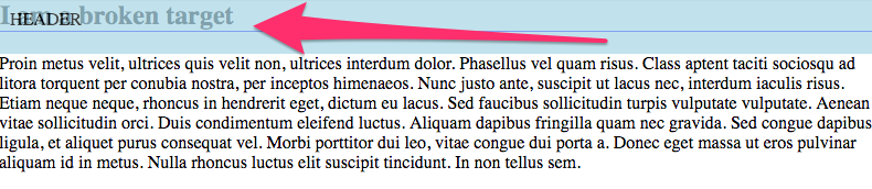
Here we see a simple <a name=”target”> anchor, which ends up behind
our header, made translucent here for demonstration purposes. This
happens because the browser navigates to the anchor by scrolling
directly to it, but scrolling that far down puts the anchor visually
right under the header. That’s a problem.
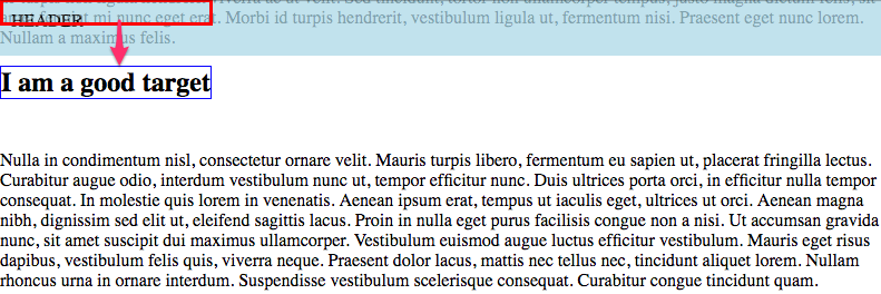
The Goal
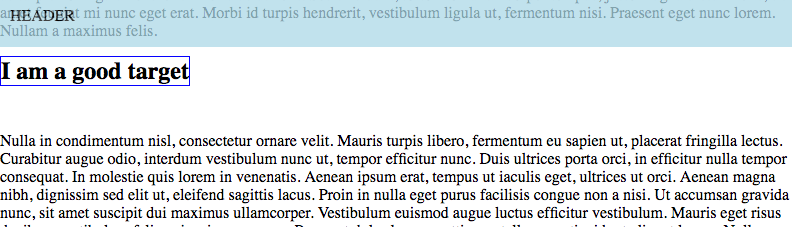
This is what we want to see, with our anchor appearing just below the fixed header. The anchor is outlined in blue. You can see here how the section before the anchor is properly behind the fixed header, and the anchor is positioned just under it as if the top of the page starts just at the header’s bottom edge.
The Trick
We can make this happen with a little CSS trick. First, look at where we actually want the top of the page to appear so that our anchor appears in the right place.
To make this happen we’re going to trick the browser into thinking the anchor is shifted above the visual location, by exactly the same height as the header we need it to appear under.
Just to set a baseline for this, we’ll look at how the header we’re working around is actually setup.
header {
  width: 100%;
  background: lightblue;
  padding: 10px;
  margin-bottom: 10px;
  position: fixed;
  height: 30px;
}
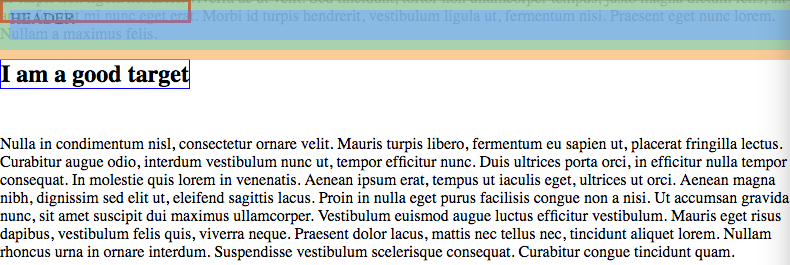
The header is styled to affix itself to the top of the window as the user scrolls. This header is 30 pixels tall, has a 10 pixel padding, and a 10 pixel margin on the bottom to separate it from the rest of the page content a bit. The box layout of the header is illustrated below.
The Details
If our “real anchor” needs to line up with the header and our “visible anchor” needs to appear just below it, then we need to position them apart by the total of the header’s height, margin, and padding. In our case, that makes an offset of 60 pixels.
Here’s our anchor’s styling:
.anchor a {
  position: absolute;
  left: 0px;
  top: -60px;
}
The visual label doesn’t need any special styling, but we do need to arrange them as siblings in the markup with a container. Note the [ ]{.title-ref} in the otherwise empty anchor! This is important, as the browser won’t see the anchor as valid without some contents to navigate to.
<div class="anchor">
<a name="target"> </a>
<h2 class="target-label">I am a good target</h2>
</div>
And the container just needs to be made a positioned element to allow our hidden anchor to be positioned relative to it, along with the visual label.
.anchor {
  position: relative;
}

You can see the whole effect demonstrated on CodePen.
For more front-end tips, check out this post about making a jQuery, or this one about CSS Grid versus frameworks.