What is responsive web design?
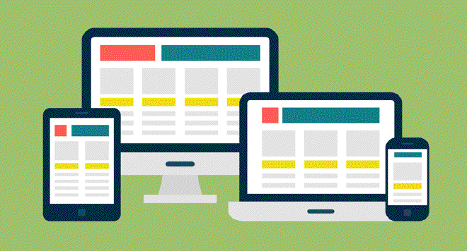
Responsive web design is an approach to web design and development whereby websites and web applications respond to a screen size of the device on which they’re being accessed. The response includes layout changes, rearrangement of content, and in some cases selective display or hiding of content elements. Using a responsive web design approach you can optimize web pages to achieve great user experience on a range of devices, from smartphones to desktop.
Responsive web design is typically accomplished by writing a set of styling rules (CSS media queries) that define how page layout should be rendered between breakpoints. Breakpoints are the pixel values at which rendition of a layout in the browser changes (or breaks); they correspond to screen widths of different devices on which web pages can be accessed.
Why choose responsive web design?
There is a clear advantage in leveraging responsive web design. With a responsive website, the same HTML with all static assets such as CSS, JavaScript, and images are served in the browser on any device. The width of the viewport in which the website is being viewed is detected by the browser and the appropriate styling rules are used to render the layout accordingly. You only write and maintain one codebase; and any code edits over time only have to be made once for the changes to be reflected on all devices. Long-term, the cost of maintenance is greatly reduced.
In adaptive web design, on the other hand, you develop different versions of the layout, each optimized for a different screen size. A script on the server detects the device used to access the website, and the appropriate version of HTML, CSS, JavaScript, and images is served in the browser. In adaptive web design approach, edits to the codebase have to be made in each version of the website separately, which means higher long-term maintenance cost.
There is also an option of building a native application for iOS, Android, or other mobile operating systems. While native applications often offer better functionality, unless the core of the business for which you build is mobile, a responsive website is a great alternative to consider. Building native applications is a lot more expensive, especially if you need to support multiple operating systems. Additionally, responsive websites are more discoverable by search engines since their content can be crawled, indexed, and ranked.
Why traditional mockups hinder responsive design and drain resources
A common approach is to design three sets of high fidelity mockups: for the smartphone (screen width of 320px), for the tablet (screen width of 768px), and for the desktop (screen width of 1024px). Sometimes four or six sets of mockups are designed to account for portrait and landscape orientations of mobile devices and for high definition desktop screens. But even the latter approach leaves out a number of viewport widths and disregards the fact that mobile web is not a collection of discrete breakpoints set apart by hundreds of pixels; it is a continuum.
Delivering high fidelity mockups for each of the target breakpoints often drains resources and results in disappointment. Mockups themselves have to go through a cycle of design, edits, and approval, a process that is effort-heavy and leads to a false sense of satisfaction that a design has been perfected. As soon as the translation of the high fidelity mockup into code begins, you discover that page elements do not behave in the perfect way the mockups would suggest.
At the cross-roads of the two realities–the perfection of a high fidelity mockup and the practicalities of living code and a browser–you can take one of two paths:
- Adjust the design to align it with a page behavior in a browser
- Write a lot of extra code to force the page into the behavior dictated by mockups
The latter is what happens most of the time, because by this stage in the process so much effort has already gone into the design, and so much has been invested both in terms of resources and commitment to the design, that it is very hard to make any major design concessions.
Getting smarter about designing for responsive web
Let’s start out by stating the obvious. Any design is constrained by the medium in which it is executed and by the context in which it will live. When working with interiors, designers must take into account the space and its shape, lighting conditions, even elements of the exterior environment in order to execute a successful design. An architect must take into account the land and the surroundings in which a building will stand. An industrial designer must consider the properties of the material that will be used to produce an object she is designing.
The same rigor applies to designing for responsive web. You’re missing the constraints of the medium and the context in which your design will live if you do not acknowledge at the onset that the perfect layout of the page you conceive of will break in the browser as the user accesses the page on a range of devices or simply resizes the browser window.
Short of designing directly in code, there is no perfect method that would allow a designer to work with and to convey the continuous nature of responsive pages, and to anticipate how content will reflow as the width of the viewport changes incrementally. But there are ways to approach designing for responsive web that help making a transition from a static design to a responsive web page somewhat easier:
- Low fidelity wireframes and prototypes. The longer you work with low fidelity wireframes and prototypes the better chance you have of identifying places where the page layout breaks in the browser before a major commitment to a high fidelity design is undertaken. At Caktus, we favor the approach of moving on to code early, well before the design reaches high fidelity. That allows us to shape the design to work with the medium, rather than to force it into the medium.
- Mobile first. Designing for smaller screens first encourages you to think about content in terms of priorities. It’s an opportunity to take a hard look at all elements of a page and to decide which ones are essential and which ones are not. If you prioritize content for smaller screens first to create great experience, you will have a much easier time translating that experience for desktop screen sizes.
- Atomic design. Instead of thinking about a website as a collection of pages, start thinking about it as a system of components. Design components that can be adjusted and rearranged across viewports; then make a plan for how those components should reflow as the width of the viewport changes.
- Style guides. Building a style guide alongside components of the website helps achieve consistency of user interface, user experience, and code. Establishing a style guide is a step that supports atomic design approach to web design. It is also an important design tool of lean UX.
- Digital prototyping tools that help convey responsive layouts. With the growing number of prototyping tools, two are worth mentioning for their ability to simulate responsive layouts: UXPin and Axure. They both come with features that allow you to set breakpoints and to mockup layouts for each breakpoint range. Using these tools does not get around the issue of designing for discrete viewport widths rather than for a continuum. However, they offer an ability to create multiple breakpoints within a single mockup, and to preview that mockup in a browser, simulating responsive behavior. This encourages the designer to focus on planning for a changing layout instead of thinking about discrete viewport widths in isolation.
Conclusions
Responsive web design is an economical long-term approach to building and maintaining a mobile website. When compared to adaptive approach, responsive web design is less expensive to maintain over a long period of time. When compared to native applications (iOS, Android, etc.), it is a less costly alternative to develop and it results in web presence that’s easier to discover by search engines. That’s why responsive web design is an approach we favor at Caktus Group.
In order for responsive web design to truly deliver on the promise of higher ROI, it must be done right. Finalizing high fidelity design mockups ahead of development process runs a risk of draining resources and may result in disappointment. For that reason at Caktus we prefer to begin the development process while the design is still in its low fidelity stage. That allows us to identify problems early and to pivot to optimize the design as needed.