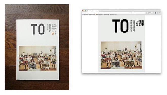
At the 2016 An Event Apart Conference in San Francisco, I peeked under the hood of a new technology that would finally address all the layout woes that we as designers and developers face: CSS Grid Layout Module. At first I was a little skeptical - except for Microsoft Edge, browser support for Grid is currently non-existent - however its official release is actually not that far off. Currently it is enabled behind a flag in Chrome and Firefox, or you can download the latest nightly or developer versions of Firefox or Safari. Here’s my brief synopsis of why I think CSS Grid is going to change the landscape of the web forever, and why I think it’s so important from a design and developer perspective.
Many website designs today are stuck in what I would call an aesthetic rut. That is, they are all comprised of similar design patterns (similar icons, sections, hero images, etc.) and are structured with common layout patterns. As many speakers at the conference pointed out, this gets boring, fast. The CSS Grid Layout Module is meant to address these concerns by implementing a dynamic method of creating elegant layouts easily, and across two dimensions. Where Flexbox only handled layout in one dimension at a time (either column or row direction), CSS Grid handles layout for columns and rows simultaneously. CSS Grid makes possible what we used to do in traditional print layout: the utilization of white space to create movement and depth, with very little code that is both responsive and easily adaptable to new content.
CSS Grid involves very little markup. A simple display: grid with its subset of attributes is all it takes. Rather than bore you with examples, check out this nifty guide. What used to comprise hundreds of lines of code wrapped in a framework (Bootstrap, Foundation, Skeleton) is now accomplished with a few lines, and presumably fewer dependencies mean an increase in performance and decrease in page load times. Grid is a great tool to prototype and design with, simply because you can now get up and running with no setup or dependencies - everything is baked into the browser.
The true power and beauty of Grid is that it allows for both complete control over layout placement, or you can let the browser do the work. You can specify column (or row) spacing, and have CSS Grid decide where to place your content. If you want to leverage more control over where your content goes on the page, you can specify where it goes with grid-column: start line/end line or grid-row: start line/end line, or a combination of both.
One of the most exciting things about CSS Grid is that we can use it now to prototype and plan for the future. My challenge to you, as designers and developers, to use it now so that when CSS Grid is released, not only will your project already take advantage of all the new and wonderful possibilities using CSS Grid, you will have also adapted the future friendly approach for your project. Need inspiration? Check out My reinterpretation of a Japanese Magazine Cover with CSS Grid.
