Design
2018

The Users We Don't Know
Businesses and organizations come to Caktus to build custom web applications that will help solve their users’ problems. Before contacting us, clients spend time and effort thinking through their users’ problems. But in doing so they do not always talk directly to potential users of the application. As a result, they come up with ideas for the application based on who they think the target users are rather than who they know those users are. Or, if they have correctly identified their target user segment, they may make assumptions about the ways users think, behave, or accomplish tasks.
2017
White Space Explained
What White Space Is
In the context of web design, white space (or negative space) is the space around and between elements on a page. To non-designers, it may seem unnecessary or an expression of a particular aesthetic (and therefore non-essential to a web page). To designers, it is an essential tool to increase the comprehension of a composition and guide a viewer’s attention and focus.
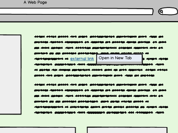
Opening External Links: Same Tab or New?
The Debate
My teammates and I recently engaged in a spirited debate over whether outbound links (links to external websites) should open in the same or in a new tab. “Same tab” was a default behavior for a set of external links on a project we were working on. A suggestion had been made, however, that the behavior be changed.
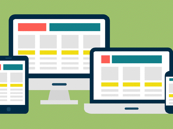
Responsive web design
What is responsive web design?
Responsive web design is an approach to web design and development whereby websites and web applications respond to a screen size of the device on which they’re being accessed. The response includes layout changes, rearrangement of content, and in some cases selective display or hiding of content elements. Using a responsive web design approach you can optimize web pages to achieve great user experience on a range of devices, from smartphones to desktop.
2016
CSS Grid, not Frameworks, are the Future
At the 2016 An Event Apart Conference in San Francisco, I peeked under the hood of a new technology that would finally address all the layout woes that we as designers and developers face: CSS Grid Layout Module. At first I was a little skeptical - except for Microsoft Edge, browser support for Grid is currently non-existent - however its official release is actually not that far off. Currently it is enabled behind a flag in Chrome and Firefox, or you can download the latest nightly or developer versions of Firefox or Safari. Here’s my brief synopsis of why I think CSS Grid is going to change the landscape of the web forever, and why I think it’s so important from a design and developer perspective.
How to tell if you’re building great user experience
In web and software development, when we talk about user experience, we usually mean the experience you have when you are using a website or an application. Does it feel like you know where to click to get to your next destination? Do you know what to do in order to accomplish a task? Has anything you’ve clicked taken you to an unexpected page? Are you getting frustrated with or are you enjoying the website or app? Answers to these and similar questions are what describes the experience you’re having as a user. That’s user experience.
Principles of good user experience (UX)
Google “UX principles” and you’ll end up with a search results page that offers:
- 5 principles…
- 31 fundamentals….
- 10 principles…
- Guidelines…
- Basics….
So let’s get this out of the way: no single checklist will guarantee that you create a great user experience. Every project is different, and the development of every product should be tailored to the user segment the product is built for. But there are some principles that can guide design decisions no matter what and you will not go wrong if you follow them. Let’s talk about a few:
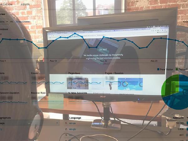
What Web Analytics Can’t Tell You About User Experience
Is analytics data collected for a website, an application, or a game sufficient to understand what problems users encounter while interacting with it and what prevents their full engagement?

What’s “User Experience” and Why It Matters
Caktus recently welcomed UX designer Basia Coulter to our team. We sat down with her to discuss her perspective on user experience design. Basia, like many in tech, came to her role through a nonlinear path. She first earned a PhD in neurobiology while in Poland, and then came to the United States for a postdoctoral fellowship. The experience led to soul searching, including seven years in a Tibetan monastery in upstate New York where, along with her spiritual interests, she pursued a passion for design, particularly web design. She subsequently devoted herself to learning more about digital communication. Basia has been in the North Carolina area for 2.5 years and currently is part of the leadership team of the local chapter of Girl Develop It and a member of local organizations such as TriangleUXPA, Code for Durham, and AIGA Raleigh.
Time for Flexbox First
The web development community has a habit of declaring “firsts” those practices and approaches that reach some ill-defined status signaling they are the go-to way to solve a particular problem. We’ve seen “mobile first” and, more recently, “offline first.” In these examples, a new problem comes along and as that problem grows more common there comes a tipping point. On the other side of that tipping point, it begins to make sense to solve the problem from the ground up, rather than building a project and solving it as an afterthought.