
Editor’s Note: This post was updated November 11, 2025 to correct the graphs that are linked to the text in the blog.
Sometimes the limit you hit when dealing with high traffic on a website isn’t the limit that needs to be raised.
We encountered this recently on a site we’re helping to maintain and upgrade. The site has been around since the very early days of Django. It was built back in the days when Apache with mod_wsgi (or even mod_python!) was one of the more common Django deployment environments.
Last year we tried to upgrade the OS for this server to Ubuntu 24.04, but ran into an oddball Python 3.12 bug when running under mod_wsgi — see this discussion on the Django Forum. We decided to stop our upgrades at Ubuntu 22.04 while we considered how to proceed.
To enable the Ubuntu 24.04 upgrade, we made a small change: swapping in Gunicorn for mod_wsgi. This required only minor Apache configuration updates and unblocked the upgrade we wanted to complete before making deeper infrastructure swaps.
Monitoring the Change
We successfully deployed the change a few weeks ago and have been monitoring how the site is handling its traffic since. The site uses Netdata for real-time monitoring and alerting of system health, so we’ve been watching the graphs to see how things are going.
We noticed a pattern of traffic starting at 8 a.m. every morning that caused mildly elevated CPU usage, lasting about ten minutes:
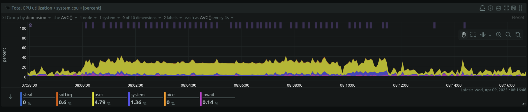
Looking back before the Gunicorn swap, we saw this traffic had been present for as far back as we looked, though the graphs were not quite so uniform with the mod_wsgi configuration. That was a clue, though we didn’t realize it at the time.
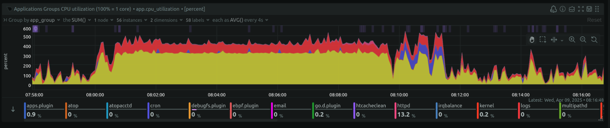
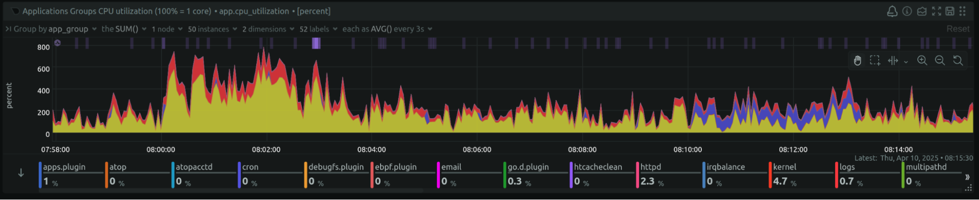
Netdata offers graphs of CPU usage by process too — here we could see Gunicorn (yellow) and the database (red) were where the CPU was being used:
Apache Worker Saturation
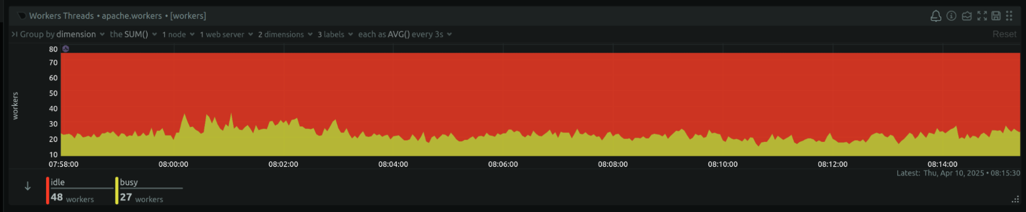
Overall this traffic didn’t seem to be overly stressful on the system — except it was causing Apache to hit its configured maximum worker number. That had been running at 250, and we increased it to 300 to better handle this traffic:
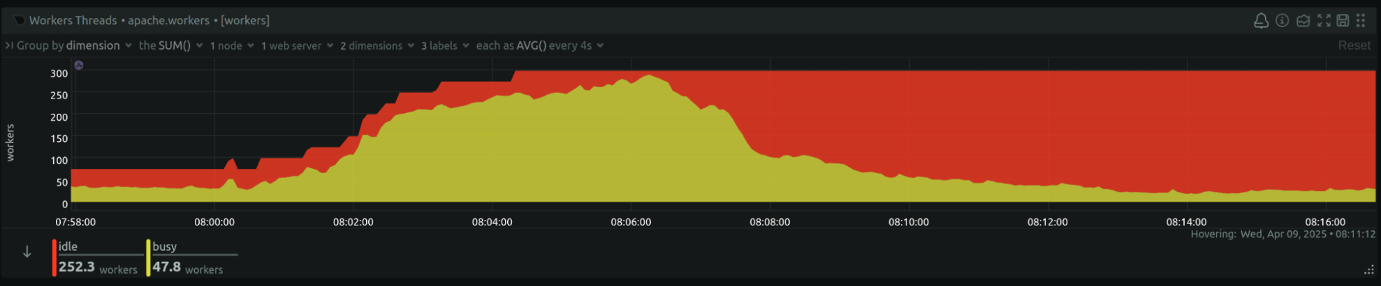
Given it seemed we were still getting close to the limit of Apache workers per its config, we wondered if we should further raise the max number of workers to avoid hitting that maximum, as the site can seem to be unresponsive when running at max worker capacity.
But we also wondered — why was the busy worker count going so high?
Since Django traffic was being proxied to Gunicorn, Apache should mostly have been serving static and media files. And while this site serves some very large media files, the Netdata graphs weren’t showing the I/O characteristics that would indicate high-volume media access.
So why were there so many busy Apache workers? Because they were waiting for Gunicorn to provide responses to the requests that had been routed there.
Finding the Real Constraint
Ah! In deciding how many Gunicorn processes or threads to run, we had underestimated how much Gunicorn capacity to provide.
Increasing the number of Gunicorn processes resulted in 8 a.m. graphs that still showed the traffic “burst” — but handled much better. Overall CPU usage spiked higher than the 40% ceiling the previous graph seemed to show:
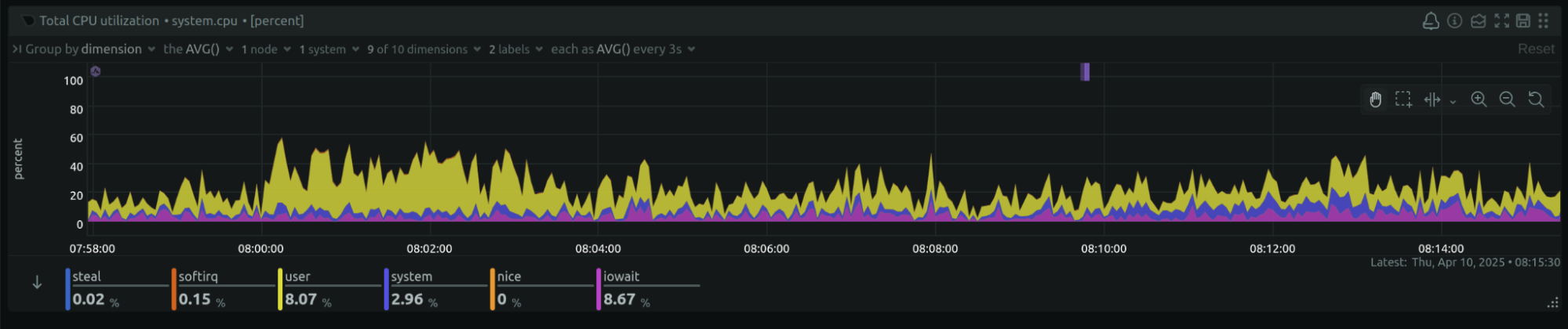
The CPU usage by Gunicorn (yellow), which seemed to be capped at 300 % in the previous graph, spiked higher after this change:
Most dramatically, the number of busy Apache workers barely blips up any more during this traffic:
Lessons Learned
Some lessons I will try to remember (I think I’ve seen this before and forgot):
The limit that you’re obviously hitting is not necessarily the constraint that needs to be eased. What is causing that limit to be hit? Perhaps the next thing in the chain is the real limiting factor.
Very level graphs (below near 100%) are evidence of some constraint being hit. That Gunicorn CPU graph level at 300 for minutes was a clue that the constraint the system was hitting was Gunicorn capacity.